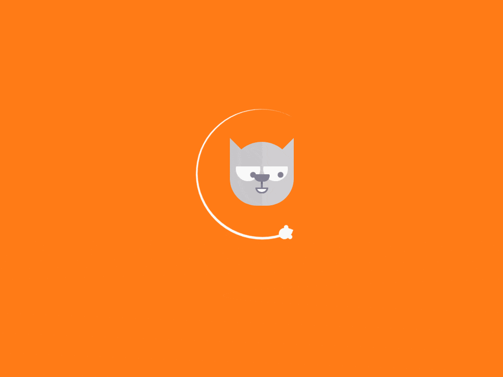
CSS прелоадер - наблюдающий кот
Оригинальный анимированный CSS прелоадер для предварительной загрузки страницы сайта, вокруг головы кота по окружности вращается мышонок, а кот наблюдает за ним подвижными глазами.
Как работает прелоадер
Весь элемент прелоадера находится в контейнере <div class="loader">, контейнер позиционирован по центру видимой области.
Размер элемента кота указан здесь body .loader {, скорость анимации регулируется в селекторах: body .loader .track {, body .loader .face .eyes-container { и body .loader .face .eyes-container .eye {. По умолчанию значение скорости выставлено в 3s.
Код CSS для установки кота
Будьте внимательны, в первой строке указан цвет фона для body {, измените цвет на подходящий основному цвету сайта при необходимости.
body {
 margin: 0;
 background: #ff7b16;
 overflow: hidden;
}

@-webkit-keyframes rotate {
 0% {
 transform: rotate(-0.08turn);
 }
 100% {
 transform: rotate(-1.08turn);
 }
}

@-moz-keyframes rotate {
 0% {
 transform: rotate(-0.08turn);
 }
 100% {
 transform: rotate(-1.08turn);
 }
}

@-o-keyframes rotate {
 0% {
 transform: rotate(-0.08turn);
 }
 100% {
 transform: rotate(-1.08turn);
 }
}

@keyframes rotate {
 0% {
 transform: rotate(-0.08turn);
 }
 100% {
 transform: rotate(-1.08turn);
 }
}

@-webkit-keyframes hideEye {
 0%, 10%, 85% {
 margin-top: 0;
 height: 50px;
 }
 30%, 65% {
 margin-top: 20px;
 height: 30px;
 }
}

@-moz-keyframes hideEye {
 0%, 10%, 85% {
 margin-top: 0;
 height: 50px;
 }
 30%, 65% {
 margin-top: 20px;
 height: 30px;
 }
}

@-o-keyframes hideEye {
 0%, 10%, 85% {
 margin-top: 0;
 height: 50px;
 }
 30%, 65% {
 margin-top: 20px;
 height: 30px;
 }
}

@keyframes hideEye {
 0%, 10%, 85% {
 margin-top: 0;
 height: 50px;
 }
 30%, 65% {
 margin-top: 20px;
 height: 30px;
 }
}

@-webkit-keyframes blink {
 0%, 10%, 85% {
 bottom: 0;
 }
 30%, 65% {
 bottom: 20px;
 }
 0% {
 transform: rotate(-0.08turn);
 }
 100% {
 transform: rotate(-1.08turn);
 }
}

@-moz-keyframes blink {
 0%, 10%, 85% {
 bottom: 0;
 }
 30%, 65% {
 bottom: 20px;
 }
 0% {
 transform: rotate(-0.08turn);
 }
 100% {
 transform: rotate(-1.08turn);
 }
}

@-o-keyframes blink {
 0%, 10%, 85% {
 bottom: 0;
 }
 30%, 65% {
 bottom: 20px;
 }
 0% {
 transform: rotate(-0.08turn);
 }
 100% {
 transform: rotate(-1.08turn);
 }
}

@keyframes blink {
 0%, 10%, 85% {
 bottom: 0;
 }
 30%, 65% {
 bottom: 20px;
 }
 0% {
 transform: rotate(-0.08turn);
 }
 100% {
 transform: rotate(-1.08turn);
 }
}

body .loader {
 position: absolute;
 left: 50%;
 top: 50%;
 width: 260px;
 height: 260px;
 margin-left: -130px;
 margin-top: -130px;
}

body .loader .track {
 width: 100%;
 height: 100%;
 border: solid white;
 border-width: 5px 5px 3px 0;
 border-top-color: transparent;
 border-radius: 50%;
 margin-left: -3px;
 margin-top: -3px;
 -webkit-animation: rotate 3s infinite linear;
 -moz-animation: rotate 3s infinite linear;
 -o-animation: rotate 3s infinite linear;
 animation: rotate 3s infinite linear;
}

body .loader .track .mouse {
 position: absolute;
 right: 31px;
 top: 18px;
 width: 25px;
 height: 25px;
 background: white;
 border-radius: 80% 0 55% 50% / 55% 0 80% 50%;
 transform: rotate(-95deg);
}

body .loader .track .mouse:before, body .loader .track .mouse:after {
 position: absolute;
 content: '';
 width: 9px;
 height: 9px;
 border-radius: 50%;
 background: inherit;
}

body .loader .track .mouse:before {
 left: 5px;
 top: -4px;
}

body .loader .track .mouse:after {
 left: 20px;
 top: 11px;
}

body .loader .face {
 position: absolute;
 left: 50%;
 top: 50%;
 width: 130px;
 height: 130px;
 margin-left: -65px;
 margin-top: -65px;
}

body .loader .face:before, body .loader .face:after {
 position: absolute;
 content: '';
 width: 50%;
 height: 100%;
}

body .loader .face:before {
 background: #c8c6c9;
 border-top-left-radius: 65px;
 border-bottom-left-radius: 55px;
}

body .loader .face:after {
 left: 50%;
 background: #d0ced1;
 border-top-right-radius: 65px;
 border-bottom-right-radius: 55px;
}

body .loader .face .ears-container {
 position: absolute;
 top: -8px;
 width: 130px;
 height: 50px;
}

body .loader .face .ears-container:before, body .loader .face .ears-container:after {
 position: absolute;
 content: '';
 width: 0;
 height: 0;
 border-top: 35px solid transparent;
 border-bottom: 35px solid transparent;
}

body .loader .face .ears-container:before {
 border-left: 35px solid #c8c6c9;
}

body .loader .face .ears-container:after {
 right: 0;
 border-right: 35px solid #d0ced1;
}

body .loader .face .eyes-container {
 position: absolute;
 overflow: hidden;
 left: 50%;
 top: 30px;
 width: 106px;
 height: 50px;
 margin-left: -53px;
 z-index: 1;
 -webkit-animation: hideEye 3s infinite linear;
 -moz-animation: hideEye 3s infinite linear;
 -o-animation: hideEye 3s infinite linear;
 animation: hideEye 3s infinite linear;
}

body .loader .face .eyes-container .eye {
 position: relative;
 bottom: 0;
 float: left;
 width: 50px;
 height: 50px;
 border-radius: 50%;
 color: #c8c6c9;
 background: white;
 -webkit-animation: blink 3s infinite linear;
 -moz-animation: blink 3s infinite linear;
 -o-animation: blink 3s infinite linear;
 animation: blink 3s infinite linear;
}

body .loader .face .eyes-container .eye:after {
 position: absolute;
 content: '';
 top: 4px;
 right: 14px;
 width: 12px;
 height: 12px;
 border-radius: inherit;
 background: #838091;
}

body .loader .face .eyes-container .eye:last-child {
 float: right;
 color: #d0ced1;
}

body .loader .face .phiz {
 position: absolute;
 left: 50%;
 top: 66px;
 width: 32px;
 height: 48px;
 margin-left: -16px;
 z-index: 1;
}

body .loader .face .phiz .nose {
 width: 100%;
 height: 15px;
 border-top-left-radius: 5px;
 border-top-right-radius: 5px;
 border-bottom-left-radius: 25px;
 border-bottom-right-radius: 25px;
 background: #838091;
}

body .loader .face .phiz .lip {
 position: relative;
 left: 50%;
 width: 4px;
 height: 12px;
 margin-left: -2px;
 background: #838091;
}

body .loader .face .phiz .lip:before {
 position: absolute;
 content: '';
 width: 100%;
 height: 5px;
 background: #767385;
}

body .loader .face .phiz .mouth {
 position: relative;
 left: 50%;
 width: 20px;
 height: 6px;
 margin-left: -13px;
 background: white;
 border: 3px solid #838091;
 border-bottom-right-radius: 12px;
 border-bottom-left-radius: 12px;
}
Код HTML для установки кота
<div class="loader">
 <div class="track">
 <div class="mouse"></div>
 </div>
 <div class="face">
 <div class="ears-container"></div>
 <div class="eyes-container">
 <div class="eye"></div>
 <div class="eye"></div>
 </div>
 <div class="phiz">
 <div class="nose"></div>
 <div class="lip"></div>
 <div class="mouth"></div>
 </div>
 </div>
</div>
Демо пример работы кода котёнка
Для просмотра примера, нажмите здесь
BootCat
- 🐱Категория:Кошки html
- 🐱Версия:1.0.0
- 🐱Рекомендовано: Для любого возраста
- 🐱Источник: Перейти
- 🐱Прикрепление: Смотреть
- 🐱Скачать: Файл
- 🐱Размер файла: 2.0 Kb
- 🐱Скачали: 28 раз
- 🐱Просмотров: 1268
- 🐱Рейтинг: 5.0 из 3 голосов
- 🐱Добавлено: 09-10-2020 в 10:40:14
- 🐱Теги:
Похожие темы

Комментарии
| Всего комментариев: 0 | |