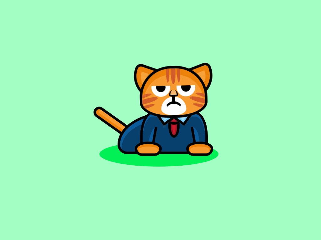
Серьёзный анимированный кот на html и css
Рыжий анимированный кот с серьёзной мордой в свитере и с галстуком покачивая головой, шевеля глазами и хвостом выглядит оригинально, картинки здесь не применяются, весь кот состоит из кода html и css стилей.
Как работает анимированный кот
Основной блок <div class="cat"> позиционируется по центру выделенного пространства. Сам кот состоит из 4 частей:
1.Голова кота - <div class="face">
2.Туловище кота - <div class="suit">
3.Хвост кота - <div class="tail">
4.Тень под котом - <div class="shadow">
Свойства анимации и трансформации css распространяются на голову (и её компоненты) и хвост, а туловище и тень под ним остаются в покое, со своими позиционированными размерами. Элемент не адаптивный, гипотетически манипуляциями с @media и размерами можно сделать его компактнее, но придётся описывать практически все селекторы и кадры анимации @keyframes. К сожалению в настоящее время на это нет времени, может быть оно появится, тогда мы дополним материал, а сейчас можем предложить только такой вариант.
<style>
body {
 background: #A4FFC4;
}
 .cat {
 position: absolute;
 top: 50%;
 left: 50%;
 transform: translate(-50%,-50%);
}
 .cat .head {
 position: relative;
 transform-origin: 50% 100%;
 animation: 15s nod infinite;
 z-index: 10;
}
 .cat .face {
 position: relative;
 width: 200px;
 height: 150px;
 background: #F89C31;
 border: 8px solid #000;
 border-top-left-radius: 100px 100px;
 border-top-right-radius: 100px 100px;
 border-bottom-left-radius: 100px 50px;
 border-bottom-right-radius: 100px 50px;
 box-shadow: inset 0 16px 0 4px #ee8408;
 overflow: hidden;
 z-index: 2;
}
 .cat .face .stripes .top {
 position: absolute;
 left: 50%;
 transform: translate(-50%,-20px);
 width: 15px;
 height: 70px;
 background: #D15B2A;
 border-radius: 100%;
}
 .cat .face .stripes .top:before, .cat .face .stripes .top:after {
 display: block;
 content: '';
 width: 10px;
 height: 60px;
 background: #D15B2A;
 border-radius: 100%;
}
 .cat .face .stripes .top:before {
 position: absolute;
 top: 5px;
 right: 20px;
}
 .cat .face .stripes .top:after {
 position: absolute;
 top: 5px;
 left: 20px;
}
 .cat .face .stripes .left {
 position: absolute;
 bottom: 40px;
 left: -20px;
 width: 70px;
 height: 15px;
 background: #D15B2A;
 border-radius: 100%;
 transform: rotate(-15deg);
}
 .cat .face .stripes .left:before, .cat .face .stripes .left:after {
 display: block;
 content: '';
 width: 60px;
 height: 10px;
 background: #D15B2A;
 border-radius: 100%;
}
 .cat .face .stripes .left:before {
 position: absolute;
 top: 20px;
 left: -5px;
}
 .cat .face .stripes .left:after {
 position: absolute;
 bottom: 20px;
 left: -5px;
}
 .cat .face .stripes .right {
 position: absolute;
 bottom: 40px;
 right: -20px;
 width: 70px;
 height: 15px;
 background: #D15B2A;
 border-radius: 100%;
 transform: rotate(15deg);
}
 .cat .face .stripes .right:before, .cat .face .stripes .right:after {
 display: block;
 content: '';
 width: 60px;
 height: 10px;
 background: #D15B2A;
 border-radius: 100%;
}
 .cat .face .stripes .right:before {
 position: absolute;
 top: 20px;
 right: -5px;
}
 .cat .face .stripes .right:after {
 position: absolute;
 bottom: 20px;
 right: -5px;
}
 .cat .face .eyes {
 position: absolute;
 top: 55px;
 width: 100%;
 height: 50px;
 border-radius: 100px;
 overflow: hidden;
}
 .cat .face .eyes:before {
 display: block;
 content: '';
 position: absolute;
 top: -20px;
 left: 50%;
 transform: translate(-50%,0);
 width: 150px;
 background: #F89C31;
 border-radius: 100%;
 z-index: 10;
 animation: 5s scowl infinite;
}
 .cat .face .eyes .left, .cat .face .eyes .right {
 position: absolute;
 top: -25px;
}
 .cat .face .eyes .left:before, .cat .face .eyes .right:before {
 display: block;
 content: '';
 width: 60px;
 height: 60px;
 background: #FFF;
 border-radius: 100%;
}
 .cat .face .eyes .left:after, .cat .face .eyes .right:after {
 display: block;
 content: '';
 position: absolute;
 top: 50%;
 left: 50%;
 transform: translate(-50%,-50%);
 width: 30px;
 height: 30px;
 background: #000;
 border-radius: 100%;
}
 .cat .face .eyes .left {
 left: 30px;
}
 .cat .face .eyes .right {
 right: 30px;
}
 .cat .face .nose {
 position: absolute;
 bottom: 60px;
 left: 50%;
 transform: translate(-50%,0);
 width: 20px;
 height: 15px;
 background: #FAB96A;
 border-left: 4px solid #000;
 border-right: 4px solid #000;
 border-bottom: 6px solid #000;
 border-top-left-radius: 30px 30px;
 border-top-right-radius: 30px 30px;
 border-bottom-left-radius: 20px 10px;
 border-bottom-right-radius: 20px 10px;
 z-index: 5;
}
 .cat .face .nose:after {
 display: block;
 content: '';
 position: absolute;
 top: 20px;
 left: 50%;
 transform: translate(-50%,0);
 width: 10px;
 height: 20px;
 background: #000;
}
 .cat .face .mouth {
 position: absolute;
 bottom: 0;
 left: 50%;
 transform: translate(-50%,0);
 width: 80px;
 height: 60px;
 background: #FFF;
 border-top-left-radius: 40px 40px;
 border-top-right-radius: 40px 40px;
 border-bottom-left-radius: 40px 20px;
 border-bottom-right-radius: 40px 20px;
}
 .cat .face .mouth:before {
 display: block;
 content: '';
 position: absolute;
 top: 15px;
 left: 50%;
 transform: translate(-50%,0);
 width: 50px;
 height: 50px;
 border-top: 8px solid #000;
 border-left: 4px solid transparent;
 border-right: 4px solid transparent;
 border-radius: 100%;
}
 .cat .ears .left {
 position: absolute;
 top: 0px;
 left: -25px;
 width: 80px;
 height: 80px;
 background: #f8a239;
 border: 8px solid #000;
 border-radius: 20px;
 border-bottom-left-radius: 80px;
 box-shadow: inset 0 0 0 15px #ee8408;
 transform: rotate(20deg);
 z-index: 0;
}
 .cat .ears .right {
 position: absolute;
 top: 0px;
 right: -25px;
 width: 80px;
 height: 80px;
 background: #f8a239;
 border: 8px solid #000;
 border-radius: 20px;
 border-bottom-right-radius: 80px;
 box-shadow: inset 0 0 0 15px #ee8408;
 transform: rotate(-20deg);
 z-index: 0;
}
 .cat .suit {
 position: relative;
 top: -20px;
 width: 200px;
 height: 120px;
 background: #08406d;
 border: 8px solid #000;
 border-top-left-radius: 40px 80px;
 border-top-right-radius: 40px 80px;
 box-shadow: inset 0 8px 0 0 #0C5C9C;
}
 .cat .suit .collar {
 position: absolute;
 left: 50%;
 transform: translate(-50%,0);
 width: 20px;
 height: 60px;
 background: #CB1B2E;
 border: 8px solid #000;
 border-bottom-left-radius: 100%;
 border-bottom-right-radius: 100%;
 box-shadow: inset 0 0px 0 5px #9e1524;
}
 .cat .suit .collar .top {
 position: absolute;
 top: -10px;
 left: 50%;
 transform: translate(-50%,0);
 width: 30px;
 height: 20px;
 background: #CB1B2E;
 border: 8px solid #000;
 border-radius: 100%;
 box-shadow: inset 0 0px 0 5px #9e1524;
 z-index: 1;
}
 .cat .suit .collar:before {
 display: block;
 content: '';
 position: absolute;
 top: -25px;
 left: -40px;
 width: 30px;
 height: 30px;
 background: #AAE0FB;
 border: 8px solid #000;
 box-shadow: inset 0 0px 0 5px #79cef9;
 transform: rotate(55deg);
 z-index: 2;
}
 .cat .suit .collar:after {
 display: block;
 content: '';
 position: absolute;
 top: -25px;
 right: -40px;
 width: 30px;
 height: 30px;
 background: #AAE0FB;
 border: 8px solid #000;
 box-shadow: inset 0 0px 0 5px #79cef9;
 transform: rotate(-55deg);
 z-index: 2;
}
 .cat .suit .arms .left {
 position: absolute;
 bottom: 0;
 left: 20px;
 width: 12px;
 height: 80px;
 background: #0C5C9C;
 border-right: 8px solid #000;
 border-top-left-radius: 80%;
 transform: rotate(10deg);
}
 .cat .suit .arms .right {
 position: absolute;
 bottom: 0;
 right: 20px;
 width: 12px;
 height: 80px;
 background: #0C5C9C;
 border-left: 8px solid #000;
 border-top-right-radius: 80% 40%;
 transform: rotate(-10deg);
}
 .cat .suit .paws .left, .cat .suit .paws .right {
 width: 70px;
 height: 30px;
 background: #F89C31;
 border: 8px solid #000;
 border-top-left-radius: 100%;
 border-top-right-radius: 100%;
 border-bottom-left-radius: 50px;
 border-bottom-right-radius: 50px;
 box-shadow: inset 0 4px 0 4px #ee8408;
}
 .cat .suit .paws .left {
 position: absolute;
 bottom: -14px;
 left: -25px;
}
 .cat .suit .paws .right {
 position: absolute;
 bottom: -14px;
 right: -25px;
}
 .cat .suit .body {
 position: absolute;
 left: -80px;
 bottom: -8px;
 width: 200px;
 height: 120px;
 background: #08406d;
 border: 8px solid #000;
 border-top-left-radius: 100%;
 border-top-right-radius: 40px;
 border-bottom-left-radius: 40px;
 box-shadow: inset 0 10px 0 5px #0C5C9C;
 z-index: -1;
}
 .cat .tail {
 position: absolute;
 left: -60px;
 bottom: 100px;
 width: 20px;
 height: 120px;
 background: #F89C31;
 border: 8px solid #000;
 border-top-left-radius: 20px;
 border-top-right-radius: 20px;
 box-shadow: inset 4px 4px 0 4px #ee8408;
 transform: rotate(-45deg);
 transform-origin: 100% 100%;
 z-index: -2;
 animation: 5s wag infinite;
}
 .cat .shadow {
 position: absolute;
 bottom: -20px;
 left: -130px;
 width: 380px;
 height: 80px;
 background: #00f155;
 border-radius: 100%;
 z-index: -3;
}
 @keyframes wag {
 0% {
 transform: rotate(-45deg);
 }
 50% {
 transform: rotate(-55deg);
 }
 100% {
 transform: rotate(-45deg);
 }
}
 @keyframes scowl {
 0% {
 height: 30px;
 }
 50% {
 height: 20px;
 }
 100% {
 height: 30px;
 }
}
 @keyframes nod {
 0% {
 transform: rotate(0);
 }
 30% {
 transform: rotate(5deg);
 }
 70% {
 transform: rotate(-5deg);
 }
 100% {
 transform: rotate(0);
 }
}

</style>

<div class="cat">

 <div class="head">

 <div class="face">

 <div class="stripes">
 <div class="top"></div>
 <div class="left"></div>
 <div class="right"></div>
 </div>

 <div class="eyes">
 <div class="left"></div>
 <div class="right"></div>
 </div>

 <div class="nose"></div>
 <div class="mouth"></div>

 </div>

 <div class="ears">
 <div class="left"></div>
 <div class="right"></div>
 </div>

 </div>

 <div class="suit">

 <div class="collar">
 <div class="top"></div>
 </div>

 <div class="arms">
 <div class="left"></div>
 <div class="right"></div>
 </div>

 <div class="paws">
 <div class="left"></div>
 <div class="right"></div>
 </div>

 <div class="body"></div>

 </div>

 <div class="tail"></div>
 <div class="shadow"></div>

</div>
Посмотрите как выглядит кот
Для этого, нажмите здесь
murchimru
- 🐱Категория:Кошки html
- 🐱Версия:1.0.1
- 🐱Рекомендовано: Для любого возраста
- 🐱Источник: Перейти
- 🐱Прикрепление: Смотреть
- 🐱Скачать: Файл
- 🐱Размер файла: 2.3 Kb
- 🐱Скачали: 24 раз
- 🐱Просмотров: 1568
- 🐱Рейтинг: 5.0 из 2 голосов
- 🐱Добавлено: 27-03-2020 в 12:40:50
- 🐱Теги:
Похожие темы
Комментарии
| Всего комментариев: 0 | |