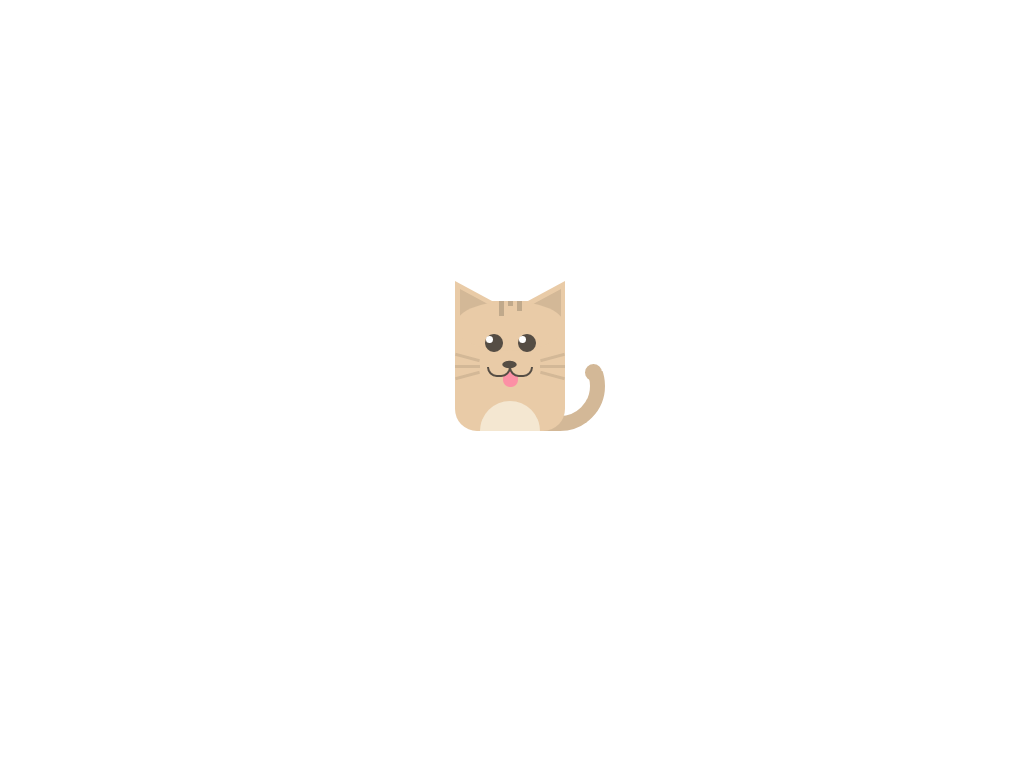
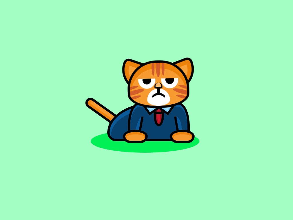
Котик с язычком - html & css
Симпатичный котик сидит вытащив свой язычок, рисунок выполнен средствами html и css, все детали хорошо сделаны и отчётливо выделяются, может показаться что это рисунок.
Как работает котик
Котик находится в блочном контейнере <div id="container">, размер контейнера в высоту height: 175px;, а в ширину width: 170px;, дополнительно контейнеру сделан внешний отступ с верху и с низу, а сам он находится по середине margin: 90px auto;. Все составляющие компоненты котика имеют точные размеры и при изменении размеров рекомендуем добавлять пропорциональные соотношения установленным значениям. Цвет котика и его компоненты тела можно изменять как вам угодно.
<style>
#container {
 margin: 90px auto;
 height: 175px;
 width: 170px;
}

#tail {
 position: absolute;
 margin-left: 40px;
 margin-top: 40px;
 height: 60px;
 width: 80px;
 border: 15px solid #D3B897;
 border-radius: 50px;
 display: inline-block;
 z-index: 0;
}

#tail-mask {
 position: absolute;
 margin-top: 40px;
 margin-left: 100px;
 height: 30px;
 width: 75px;
 background-color: #fff;
 z-index: 0;
}

#tail-end {
 position: absolute;
 margin-top: 63px;
 margin-left: 130px;
 height: 17px;
 width: 17px;
 border-radius: 50%;
 background-color: #D3B897;
 z-index: 1;
}

#body {
 position: relative;
 height: 130px;
 width: 110px;
 background-color: #E9CBA7;
 border-radius: 22px;
 display: inline-block;
 overflow: hide;
 z-index: 1;
}

.ear {
 position: relative;
 margin-top: -20px;
 height: 45px;
 width: 50px;
 background-color: #E9CBA7;
 display: inline-block;
 z-index: 2;
}

#ear-left {
 clip-path: polygon(0 0, 0% 100%, 100% 60%);
}

#ear-right {
 margin-left: 6px;
 clip-path: polygon(100% 0, 0% 60%, 100% 100%);
}

.ear-inner {
 position: relative;
 height: 30px;
 width: 50px;
 background-color: #D3B897;
 z-index: 3;
}

#ear-inner-left {
 margin-top: 8px;
 margin-left: 5px;
 clip-path: polygon(0 0, 100% 90%, 0 100%);
}

#ear-inner-right {
 margin-top: 8px;
 margin-left: -4px;
 clip-path: polygon(100% 0%, 100% 100%, 0 90%);
}

#mask {
 position: relative;
 background-color: #E9CBA7;
 margin-top: -29px;
 height: 50px;
 width: 110px;
 border-radius: 50%;
 z-index: 4;
}

#patch {
 position: relative;
 margin-top: -50px;
 z-index: 5;
}

.fur {
 width: 5px;
 background-color: #C0A98B;
 display: inline-block;
}

.fur:first-of-type {
 margin-left: 40%;
 height: 15px;
 float: left;
}

.fur:nth-of-type(2) {
 margin-left: 4px;
 height: 5px;
 float: left;
}

.fur:nth-of-type(3) {
 margin-left: 4px;
 height: 10px;
 float: left;
}


#eyes {
 position: relative;
 margin-top: 30%;
 z-index: 5;
}

.eye {
 height: 18px;
 width: 18px;
 border-radius: 50%;
 background-color: #554D44;
 display: inline-block;
}

#eye-left {
 margin-left: 27%;
}

#eye-right {
 margin-left: 10%;
}

.shine {
 height: 7px;
 width: 7px;
 border-radius: 50%;
 background-color: #fff;
 margin-top: 2px;
 margin-left: 1px;
}

#whisk-left {
 display: inline-block;
}

.whisker {
 height: 3px;
 width: 25px;
 background-color: #D3B897;
 margin-bottom: 6px;
}

#whisk-one {
 transform: rotate(15deg);
}

#whisk-three {
 transform: rotate(-15deg);
}

#nose {
 position: absolute;
 margin-left: 15%;
 height: 17px;
 width: 18px;
 background-color: #554D44;
 clip-path: ellipse(40% 22% at 50% 50%);
 display: inline-block;
 z-index: 6;
}

#whisk-right {
 display: inline-block;
 margin-left: 56px;
}

#whisk-four {
 transform: rotate(-15deg);
}

#whisk-six {
 transform: rotate(15deg);
}

#smile {
 position: relative;
 margin-left: 29%;
 margin-top: -22%;
 z-index: 5;
}

#smile-left-align {
 display: inline-block;
 position: absolute;
}

#smile-left {
 height: 10px;
 width: 20px;
 border-radius: 0 0 10px 10px;
 background-color: #E9CBA7;
 border: 2px solid #554D44;
}

#mask-left {
 margin-top: -58%;
 height: 4px;
 width: 20px;
 background-color: #E9CBA7;
}

#smile-right-align {
 display: inline-block;
 margin-left: 22px;
 position: absolute;
}

#smile-right {
 height: 10px;
 width: 20px;
 border-radius: 0 0 10px 10px;
 background-color: #E9CBA7;
 border: 2px solid #554D44;
}

#mask-right {
 margin-top: -58%;
 height: 4px;
 width: 24px;
 background-color: #E9CBA7;
}

#tongue {
 position: relative;
 margin-top: 7px;
 margin-left: auto;
 margin-right: auto;
 height: 17px;
 width: 15px;
 border-radius: 25px;
 background-color: #FC90A5;
 z-index: 4;
}

#tummy {
 margin-top: 13%;
 margin-left: auto;
 margin-right: auto;
 height: 30px;
 width: 60px;
 border-radius: 50px 50px 0 0;
 background-color: #F4E7D1;
}
</style>

<div id="container">

 <div id="tail"></div>
 <div id="tail-mask"></div>
 <div id="tail-end"></div>

 <div id="body">
 <div class="ear" id="ear-left">
 <div class="ear-inner" id="ear-inner-left"></div>
 </div>
 <div class="ear" id="ear-right">
 <div class="ear-inner" id="ear-inner-right"></div>
 </div>

 <div id="mask"></div>

 <div id="patch">
 <div class="fur"></div>
 <div class="fur"></div>
 <div class="fur"></div>
 </div>

 <div id="eyes">
 <div class="eye" id="eye-left">
 <div class="shine" id="shine-left"></div>
 </div>
 <div class="eye" id="eye-right">
 <div class="shine" id="shine-right"></div>
 </div>
 </div>

 <div id="whisk-left">
 <div class="whisker" id="whisk-one"></div>
 <div class="whisker"></div>
 <div class="whisker" id="whisk-three"></div>
 </div>

 <div id="nose"></div>

 <div id="whisk-right">
 <div class="whisker" id="whisk-four"></div>
 <div class="whisker"></div>
 <div class="whisker" id="whisk-six"></div>
 </div>

 <div id="smile">
 <div id="smile-left-align">
 <div id="smile-left"></div>
 <div id="mask-left"></div>
 </div>

 <div id="smile-right-align">
 <div id="smile-right"></div>
 <div id="mask-right"></div>
 </div>
 </div>

 <div id="tongue"></div>
 <div id="tummy"></div>
 </div>

</div>
Демо пример котика
Посмотрите как выглядит котик в реальном времени, нажмите здесь
murchimru
- 🐱Категория:Кошки html
- 🐱Версия:1.0.1
- 🐱Рекомендовано: Для любого возраста
- 🐱Источник: Перейти
- 🐱Прикрепление: Смотреть
- 🐱Просмотров: 1066
- 🐱Рейтинг: 5.0 из 1 голосов
- 🐱Добавлено: 27-03-2020 в 08:57:01
- 🐱Теги:
Похожие темы
Комментарии
| Всего комментариев: 0 | |